Overview
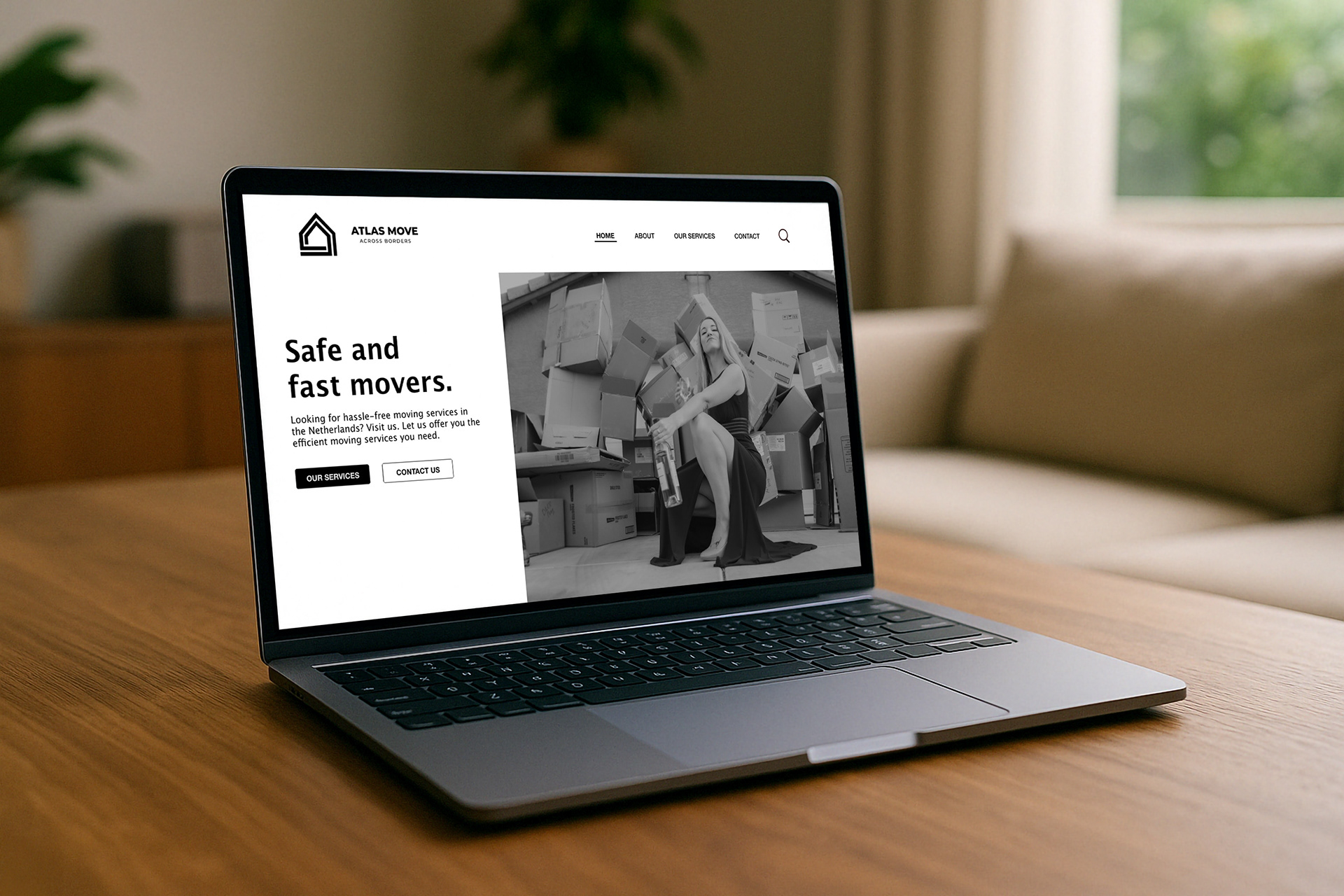
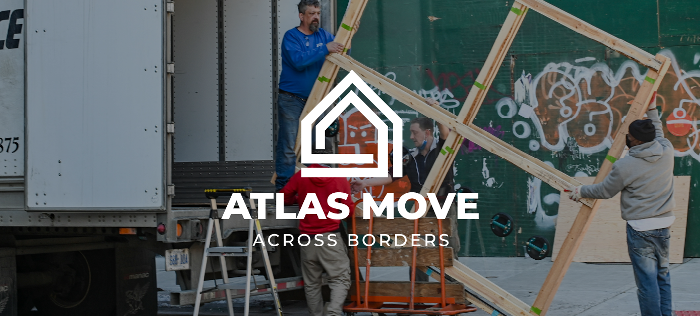
Atlas Move is a premium international moving company that helps individuals, families, and professionals relocate across borders with ease. The brand stands for trust, reliability, and a seamless transition into a new chapter treating every move not just as a service, but as a personal journey.
Brand keywords:
Global · Trustworthy · Professional · Strong · Minimal · Friendly · Secure · International · Bold · Efficient
Project deliverables:
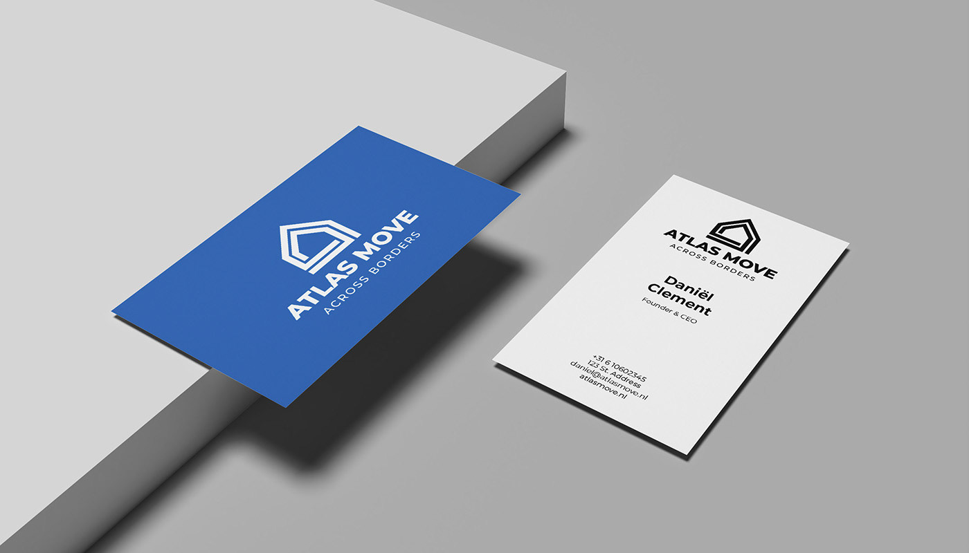
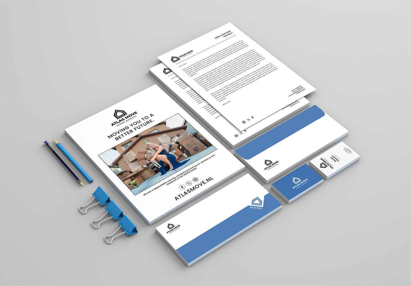
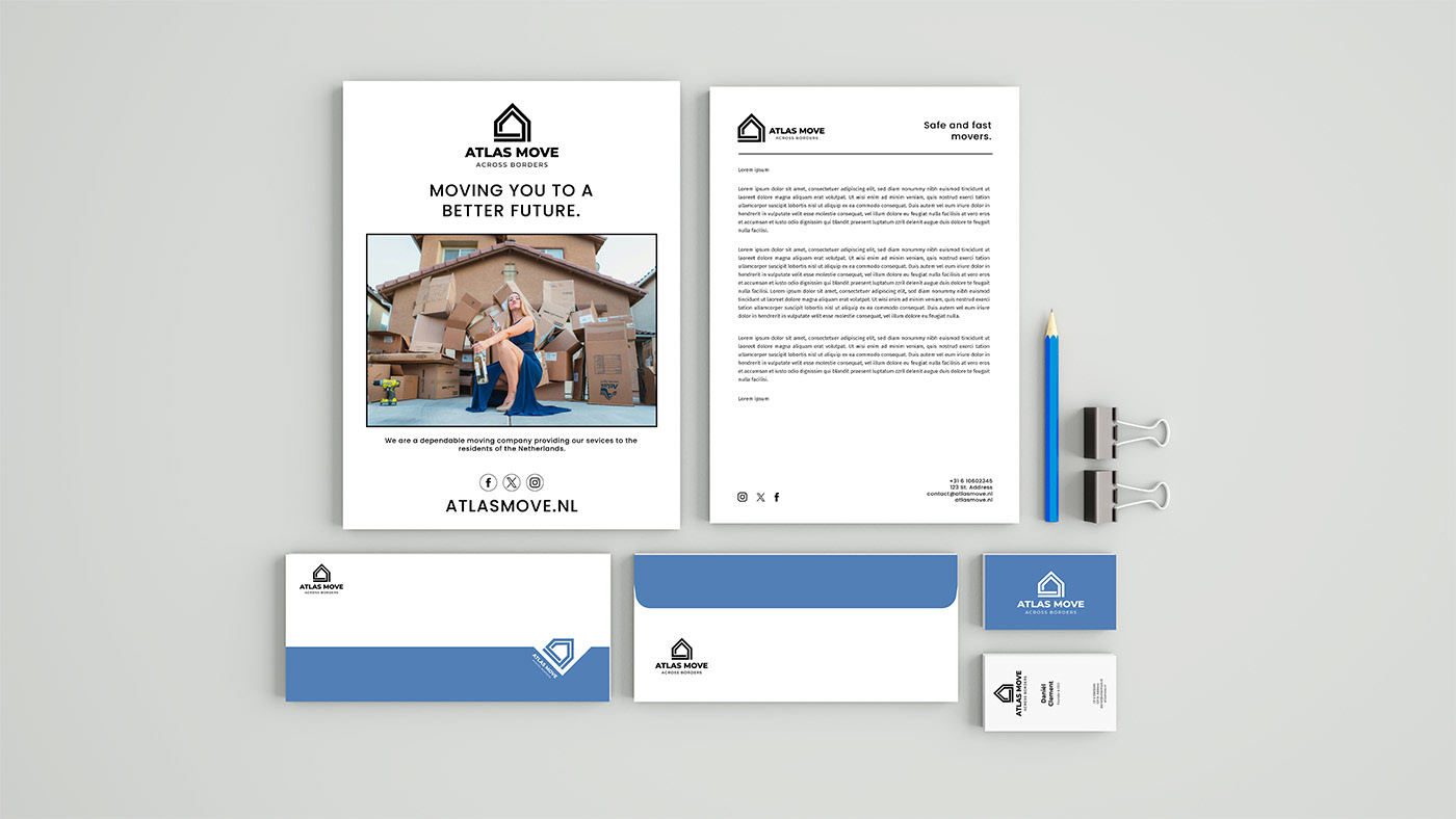
Logo & Icon System · Color Palette & Brand Typography · Business Card Design · Brand Guidelines Overview · Social Media Mockups · Stationery Concept
My Approach
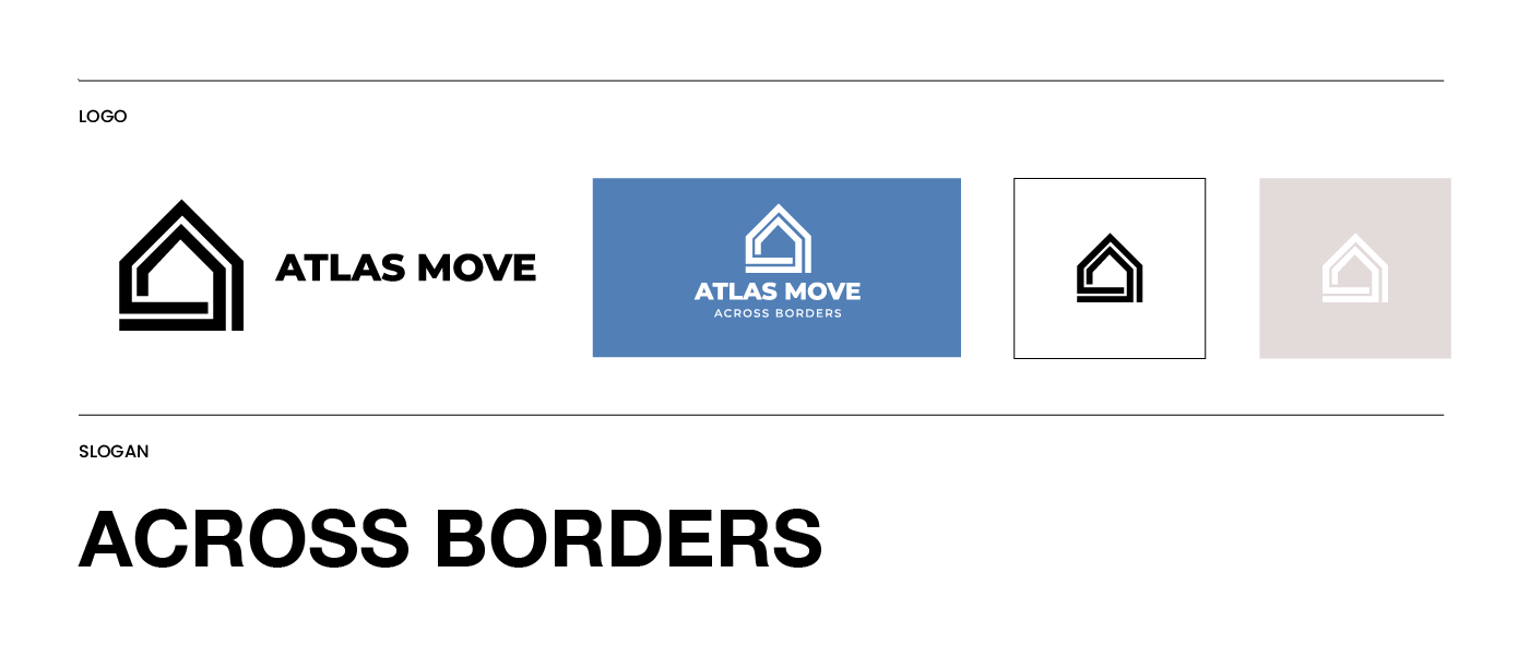
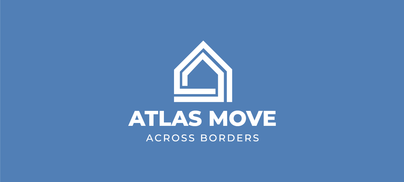
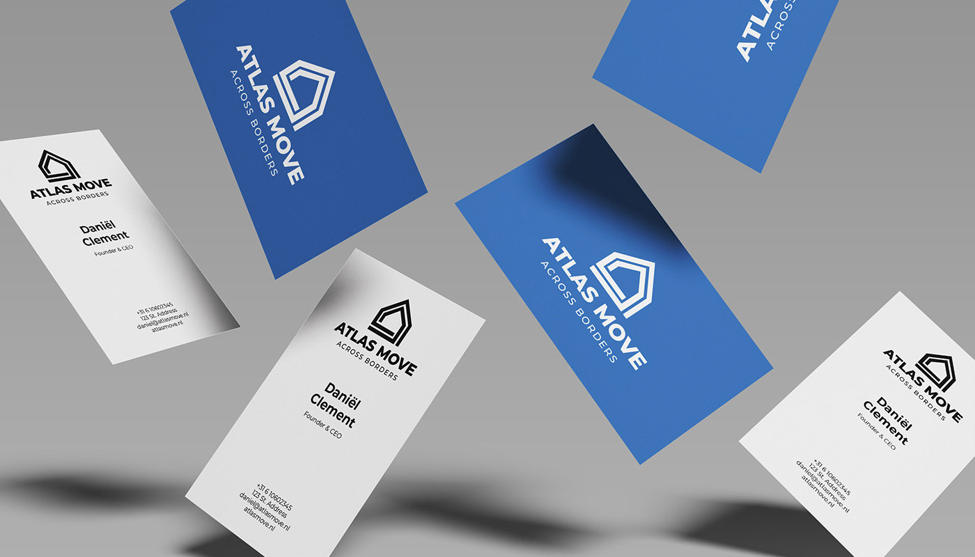
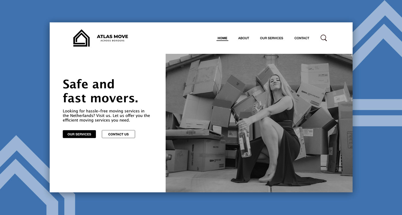
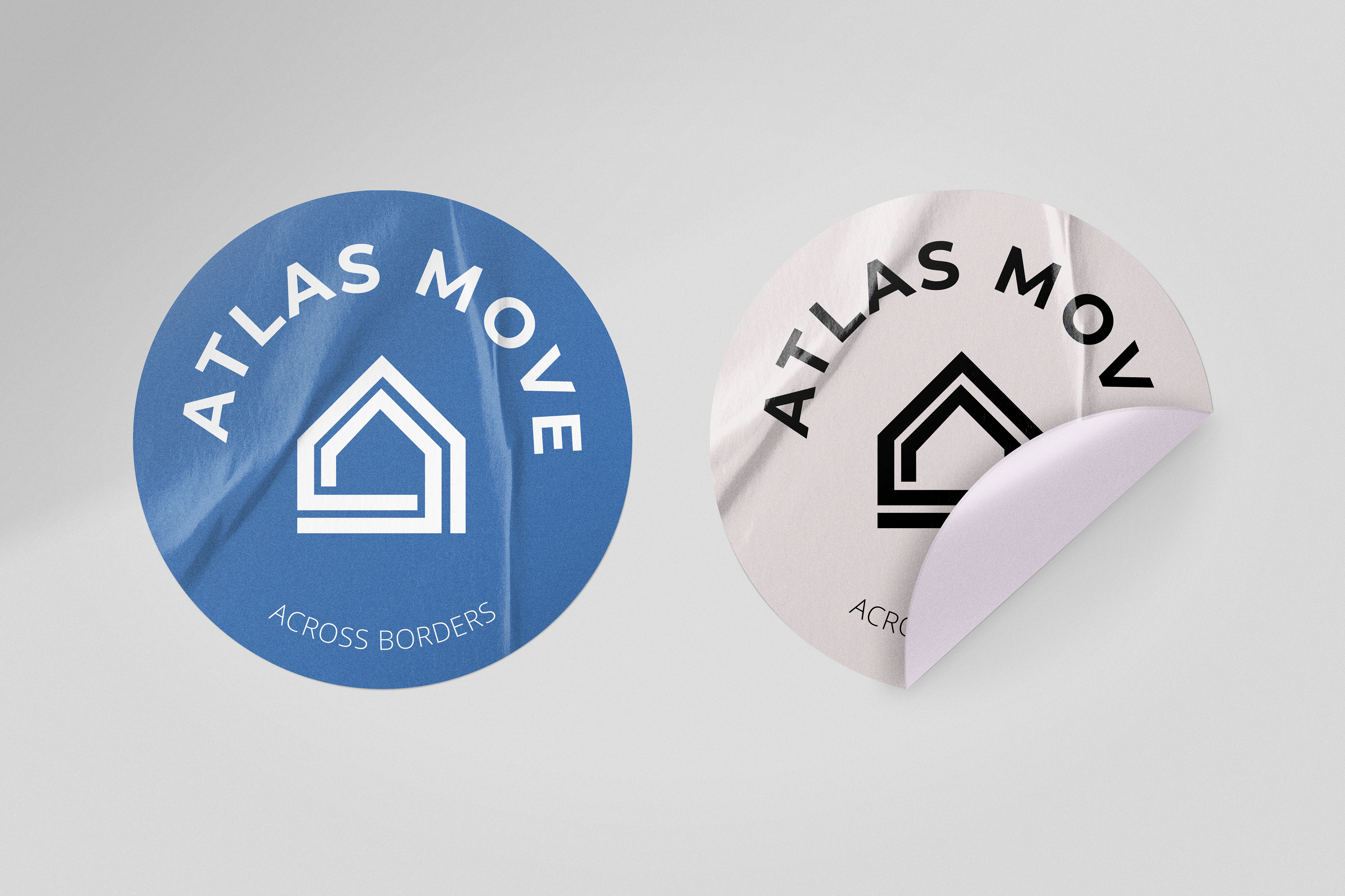
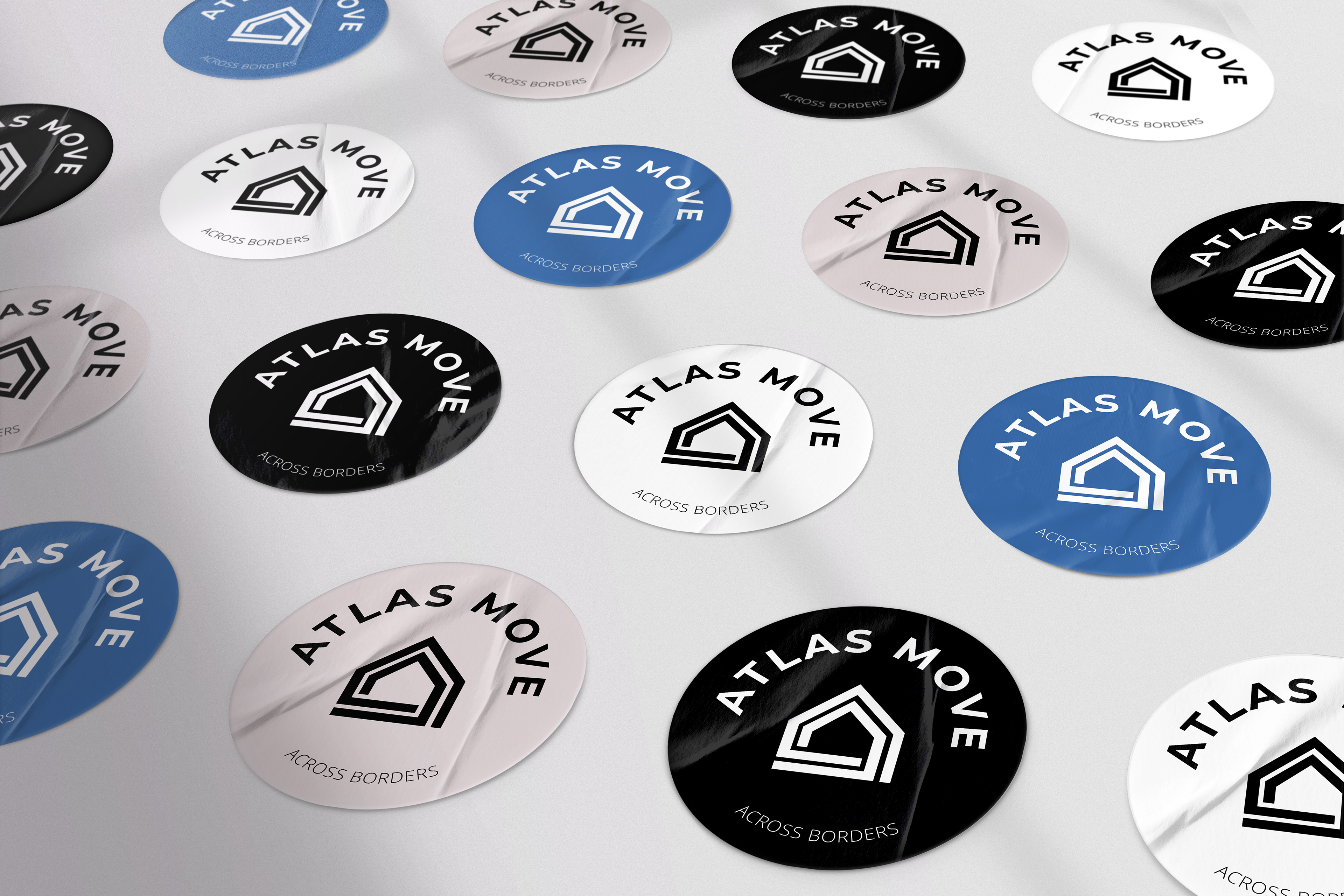
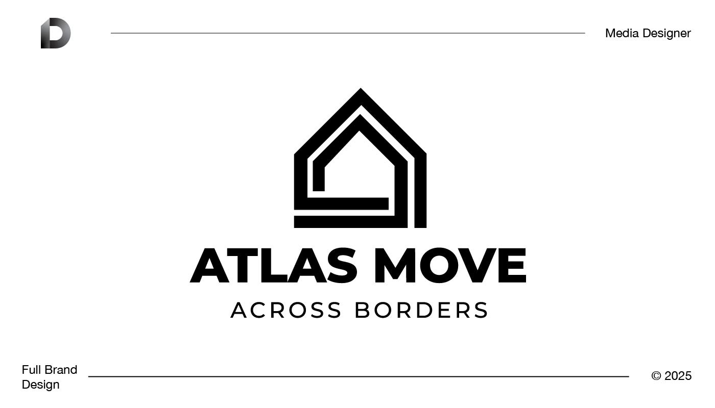
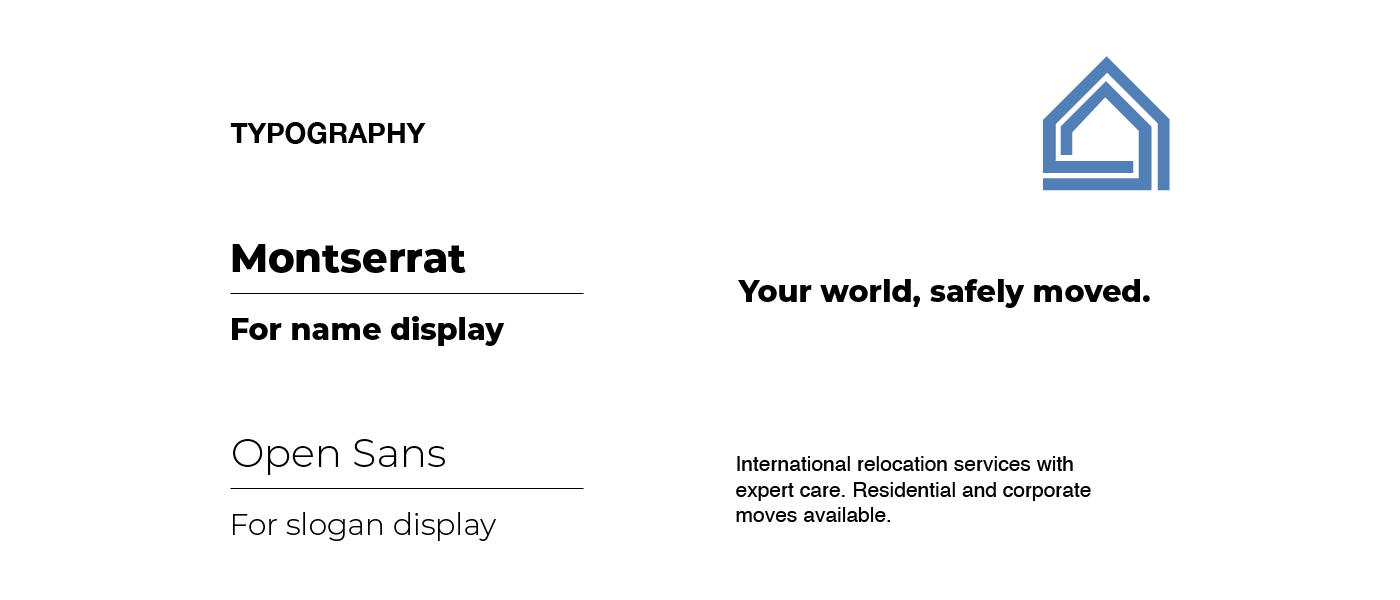
The concept for Atlas Move was centered around movement, structure, and home. I explored geometric shapes to symbolize houses and paths, eventually landing on a stylized house icon that integrates directional lines to reflect progress and relocation.
For the logotype, I selected a clean, bold sans-serif typeface to establish strength and trust. It pairs harmoniously with a softer, lighter font in the slogan — “Across Borders” — which reinforces the brand’s international focus with a more welcoming tone.